Essential Tips for Directional Reporting in GA4 — Whiteboard Friday
The author's views are entirely their own (excluding the unlikely event of hypnosis) and may not always reflect the views of Moz.
Originally published in August 2024, this episode of Whiteboard Friday discusses the importance of directional reporting in GA4. With things like ad blockers making it more and more difficult to get accurate data, Dana reminds us that it's more important to show directional improvement than solid numbers. She also provides practical tips for how to present traffic data to key stakeholders and clients.
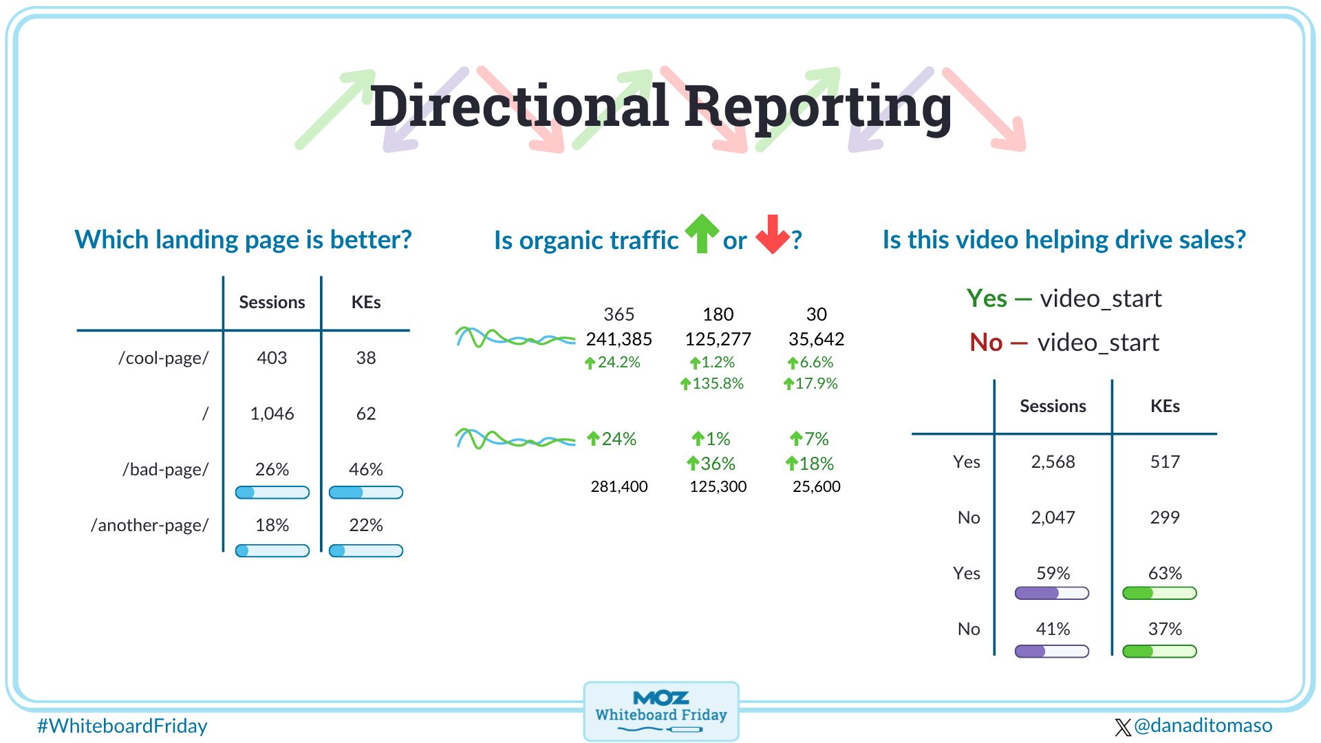
Click on the whiteboard image above to open a high-resolution version!
Howdy Moz fans, my name is Dana DiTomaso. I'm the founder and lead instructor of the Kick Point Playbook, which is an online learning platform for all things digital marketing, and I particularly focus on analytics.
Now, I've been an SEO for a long time, I started in this field more than 20 years ago, so I know all about talking to clients about results. And if you're struggling with these kinds of conversations, because maybe you watched my last Whiteboard Friday on here where I told you all your analytics data was wrong, and that was sad, and you were probably sad about it. But you're probably still reporting in exactly the same way to your clients, your boss, your team.
Focus on directionality
And I am here today to show you some different ways you can report on the data you have so that you're not focusing so much on whether or not the numbers were accurate, but instead, you're focusing on what the numbers are telling you. So that way, you don't end up in those conversations that you've had, I'm sure at some point with your boss, your clients where you say, "And we had 18 form fills." And they say, "Well, I see 28 form fills in my CRM. Why are you lying to me?" And you're like, "Well, ad blockers, cookies, et cetera." And they're like, "No, I don't believe you, get outta here." That's a really hard conversation to have, and you can avoid that by not over-focusing on specific numbers but instead focusing on directionality, which we're gonna be talking about today in this Whiteboard Friday.
So, what I've got on the whiteboard behind me in my left-hand writing — apologies in advance — are three questions you probably already ask yourself all the time when it comes to your reporting. These are questions that people want to know often, and we already report on them, but we could probably be reporting on them better.
Which landing page is better?

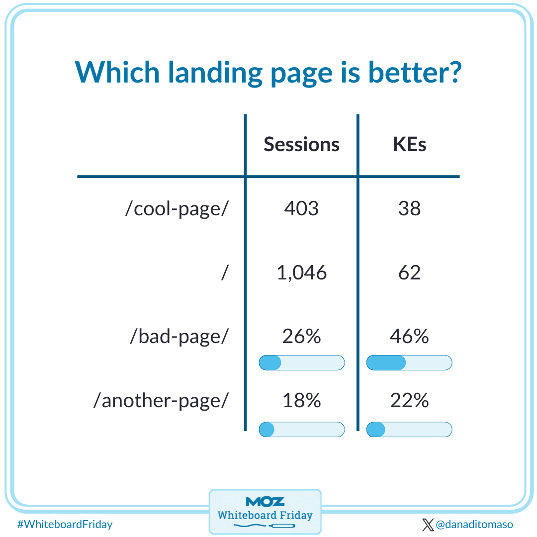
So, first question we're gonna look at, which landing page is better? You’ve got a website, people land on it. Do they do the thing you wanted them to do when they start on a page that you want them to start on? Yes, no, right?
The way we deliver this data now is we have the page, and then we have the number of sessions, 400 sessions, 10,000 sessions, for example, and then we'll have the number of key events. Now I'm saying "Key events" because I do GA4 training, I have to change my lingo at some point, but you can still call it conversions. You don't have to do what Google tells you to do and call everything key events; keep calling it conversions. So we have 38 key events, we have 62 key events. Instead, what I want you to do is change this to be from numbers to instead make it a percentage of a total.
This is a setting in Looker Studio, you just have to hover your mouse over the metric name, click on the pencil icon, and then choose to report on percentage of total. So instead of saying it's 403 sessions and 38 key events, we could say instead that this is 20% of sessions and it's 46% of key events. Look how great this page is. It's clearly punching above its weight in terms of the percentage of overall sessions that start there versus the number of key events that it's bringing from your website.
This is a really great way to show which pages are doing really well and which pages aren't doing really well and then you can look at the pages that aren't doing well and say, "How can we replicate the things that those pages are doing well on the pages that maybe aren't doing so well?"

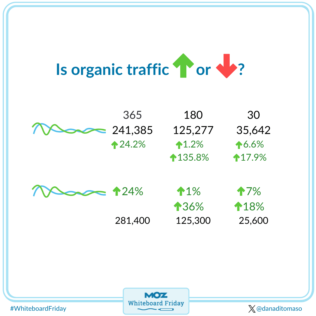
Second question you ask yourself all the time, is our organic traffic going up or going down? The eternal SEO question. So I have here something that I call a rolling dashboard, I don't know if this is the official name for it or not; this is just what I call it. And again, this is in Looker Studio.
So we have these blue squiggly lines, pretend this is year over year traffic, great art going on here, and then we have 365 days compared to the previous 365, 180 compared to the previous period, compared to the previous year, 30 days compared to the previous period and previous year. And I would present the numbers, so I would say you had "241,385 sessions in the last previous 365 days, and that's up 24.2%." This is a lot of numbers, especially if you're going through individual channels. So if you're saying, "Here's all the traffic, here's organic, here's social, here's everything else." It's a lot of data to parse through. And again, remember this data isn't accurate, and ultimately when we look at these numbers, does 24.2% actually mean anything compared to 24% when you're looking at an entire year of data? It doesn't; that's a rounding error.
So instead, what I would like you to do is change it so that the percentages are the big numbers. Instead of 24.2%, you're gonna have 24% and make it large and remove that decimal point because it's meaningless anyway. And then you're still gonna have the numbers underneath, they're just gonna be a lot smaller. And what you'll see as well is that I've removed the precision from the numbers. Instead of saying it's 241,385 sessions, we're saying that it's 241,400 sessions, and I have a blog post on my website that I'm gonna link to in the transcript of this particular Whiteboard Friday that will show you how to do this kind of rounding in Looker Studio, because the round function doesn't actually work with whole numbers, so we're doing a little bit of fancy footwork to get it to round numbers.
What I like about rounding the numbers is then it removes that idea of accuracy, and it's a great way to start to introduce the idea of directionality with your boss, your clients, who are like, "I can track everything, right?" Sadly, you can't, you haven't been able to for years. So by rounding numbers, you start to take that one baby step towards introducing them to the idea of directionality by saying, "You know what? We know this data isn't 100% accurate, but here's the direction it's going in; we're just gonna remove that precision because it was a bunch of fantasy anyway and fairytales."
Is this video helping to drive sales?

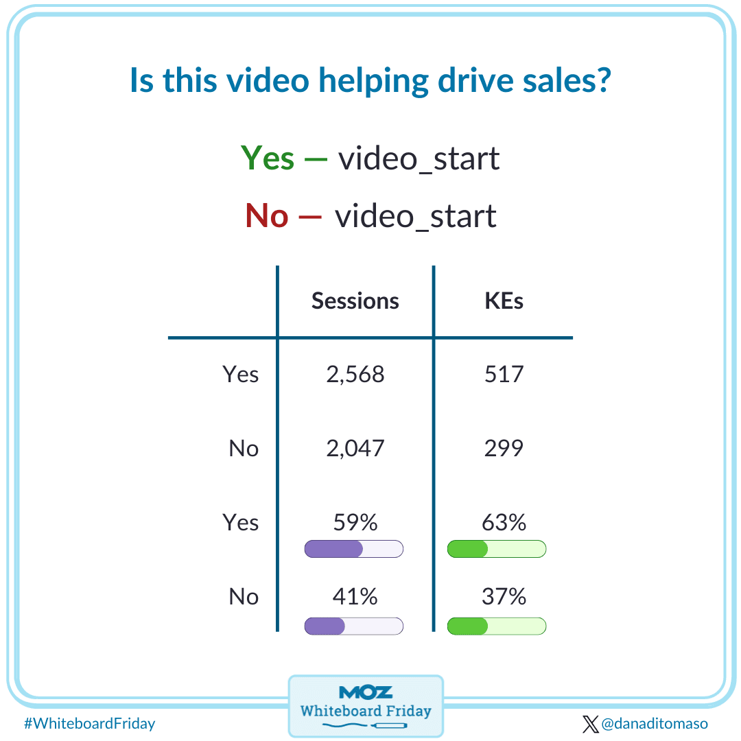
All right, last question you're gonna ask yourself, is this video helping to drive sales? I'm sure that you have been in the situation, like I have, where your boss, your client comes to you and they're like, "I made a video! I'm so excited about this video, I think it should go everywhere on the website, and I think it's gonna make me so much money." And you're like, "Okay, sure client, it is." But maybe they're right, maybe it is gonna make a bunch of money, but you don't know for sure until you test it. How are you gonna test it?
In GA4, you can create audiences, and if you aren't familiar with GA4 audiences, they are great, I enjoy them quite a bit, and I have a Whiteboard Friday right here in this very site that talks about audiences, so I recommend checking that out as well. Now, what we're gonna do is create two audiences. We have a positive audience, this is where people said yes to video start. Now we're gonna have a negative audience, this is where people didn't start the video at all. And then of course, you would typically report on this in a boring table where you would say that we had this number of sessions that said yes to video, and then we had this number of key events, conversions, and same thing with no, this number of sessions, this number of key events/conversions.
When you look at this data, can you tell right away if the video is doing a good job or not? No, because numbers are boring, and tables are boring. Instead, we're gonna take the same trick that we had back in the first table that we looked at, where we instead change the numbers to percentage of the total. And again, in Looker Studio, to do that, mouse over the metric, click the pencil icon, and then choose percentage of total from the dropdown and then you can see that we have about the same number of sessions, but you can tell that the video is actually doing a fantastic job at driving more conversion/key events for this particular client. I guess the client was right, I guess it is a good video. You can tell them that. But by presenting it again as percentages, you can see what I always call punching above your weight or punching below your weight because I used to box, and I think that that's a great way to present this data. How good is this thing doing relative to the whole? As opposed to focusing on those specific numbers, which may or may not be true.
So there's three examples for you, you can take things that you already report on and instead change the report in a directional fashion. I find that this really helps to get to those conversations about how accuracy and ad blockers and third-party consent and everything else is happening to make our analytics data inaccurate, you can take those conversations and show the data in a different light, and it helps remove that idea that you have to fix something to make it accurate, which unfortunately you can't, it's not gonna be accurate, that ship has sailed, and instead, you're focusing on the data that you do have and what you can do with it to generate good results that helps give you insights so that you know what to do in order to improve your marketing, your sales, ultimately whatever goal you're trying to accomplish with your website and your business.
I hope you found that helpful. If you have any questions at all, feel free to reach out to me, I'm usually on LinkedIn, and thank you so much for watching.


![How to Create an SEO Forecast [Free Template Included] — Whiteboard Friday](png/wbf-seoforecasting-blog_headerb5ca.png)
